Nat bij Regen
Defilé tweeduizendzesentwintig
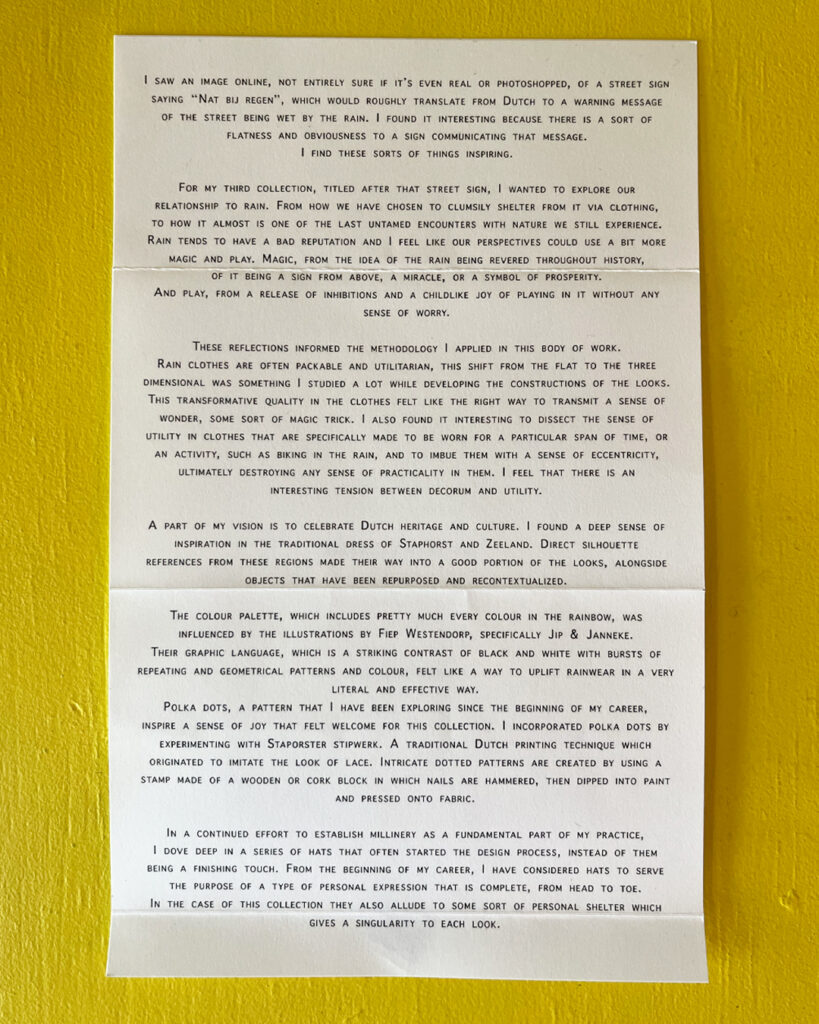
I saw an image online, not entirely sure if it’s even real or photoshopped, of a street sign saying “Nat bij regen”,
which would roughly translate from Dutch to a warning message of the street being wet by the rain. I found it
interesting because there is a sort of flatness and obviousness to a sign communicating that message. I find
these sorts of things inspiring.
For my third collection, titled after that street sign, I wanted to explore our relationship to rain. From how we have
chosen to clumsily shelter from it via clothing, to how it almost is one of the last untamed encounters with nature
we still experience. Rain tends to have a bad reputation and I feel like our perspectives could use a bit more
magic and play. Magic, from the idea of the rain being revered throughout history, of it being a sign from above, a
miracle, or a symbol of prosperity. And play, from a release of inhibitions and a childlike joy of playing in it without
any sense of worry.
These reflections informed the methodology I applied in this body of work. Rain clothes are often packable and
utilitarian, this shift from the flat to the three dimensional was something I studied a lot while developing the
constructions of the looks. This transformative quality in the clothes felt like the right way to transmit a sense of
wonder, some sort of magic trick. I also found it interesting to dissect the sense of utility in clothes that are
specifically made to be worn for a particular span of time, or an activity, such as biking in the rain, and to imbue
them with a sense of eccentricity, ultimately destroying any sense of practicality in them. I feel that there is an
interesting tension between decorum and utility.
A part of my vision is to celebrate Dutch heritage and culture. I found a deep sense of inspiration in the traditional
dress of Staphorst and Zeeland. Direct silhouette references from these regions made their way into a good
portion of the looks, alongside objects that have been repurposed and recontextualized.
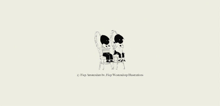
The colour palette, which includes pretty much every colour in the rainbow, was influenced by the illustrations by
Fiep Westendorp, specifically Jip & Janneke. Their graphic language, which is a striking contrast of black and
white with bursts of repeating and geometrical patterns and colour, felt like a way to uplift rainwear in a very literal
and effective way.
Polka dots, a pattern that I have been exploring since the beginning of my career, inspire a sense of joy that felt
welcome for this collection. I incorporated polka dots by experimenting with Staporster stipwerk. A traditional
Dutch printing technique which originated to imitate the look of lace. Intricate dotted patterns are created by
using a stamp made of a wooden or cork block in which nails are hammered, then dipped into paint and pressed
onto fabric.
In a continued effort to establish millinery as a fundamental part of my practice, I dove deep in a series of hats
that often started the design process, instead of them being a finishing touch. From the beginning of my career, I
have considered hats to serve the purpose of a type of personal expression that is complete, from head to toe. In
the case of this collection they also allude to some sort of personal shelter which gives a singularity to each look.
Pablo Salvador Willemars